Friday, August 26, 2016
Designing for Multi Window
Designing for Multi Window
Posted by Ian Lake, Developer Advocate
As a developer, there’s a wide range of features added in Android N to take advantage of, but when it comes to designing and building your UI, having strong multi-window support should be at the forefront.
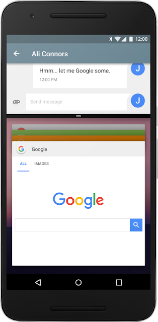
The primary mode that users will be interacting with multi-window is through split-screen mode, which is available on both handheld devices and larger tablets. In this mode, two apps split the available screen space and the user can drag the divider between the two split screens to resize the apps. As you might imagine, this mode offers some unique design challenges beyond what was needed previously.
An even more responsive UI
The lessons learned from previous versions of Android, the mobile web, and desktop environments still apply to Android N. Designing a responsive UI is still an important first step towards an amazing multi-window experience.

A responsive UI is one that adapts to the size provided, picking the best representation of the content and the appropriate navigation patterns to make a great user experience on any device. Check out the Building a Responsive UI blog post for details on how to design and build an effective responsive UI.
Adapting your layout
As you’re designing layouts for the largest and smallest screens and everything in between, it is important to make resizing a smooth and seamless transition as mentioned in the split screen layout guidelines. If you already have a similar layout between mobile and tablet, you’ll find much of your work taken care of for you.
However, if your mobile and tablet layouts are vastly different and there’s no way to smoothly transition between the two, you should not transition between them when resizing. Instead, focus on making your tablet UI scale down using the same responsive UI patterns. This ensures that users do not have to relearn their UI when resizing your app.
Note that the minimalHeight and minimalWidth layout attributes allow you to set a minimum size you want reported to your Activity, but they do not mean the user cannot resize your activity smaller - it actually means that your activity will be cropped to the size the user requests, potentially forcing elements of your UI off the screen. Strive to support down to the minimum size of 220x220dp.
Design configurations to consider
While many of the sizes and aspect ratios possible in multi-window are similar to existing devices (1/3rd of a landscape tablet is similar to existing mobile devices in screen size), there are a few configurations that are much more common when considering multi-window.

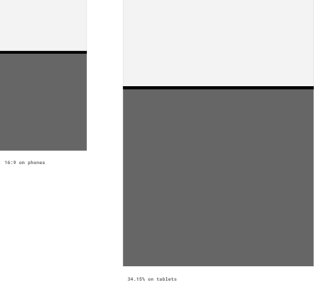
The first is a 16x9 layout on mobile devices in portrait. In this case, the vertical space is extremely limited. If you have a number of fixed elements stacked on top of one another (a toolbar, scrolling content, and a bottom navigation bar), you might find there’s not actually any room for the scrolling content - the most important part!
The second case to consider is the 34.15% layout on tablets. The very wide aspect ratio in device portrait or very tall aspect ratio in device landscape orientation are more extreme than what is found on existing devices. Consider using your mobile layouts as a starting point for this configuration.
Patterns to avoid
When it comes to multi-window, there are a few patterns you want to avoid entirely.
The first is UI interactions that rely on swiping from the edge of the screen. This has already been somewhat of an issue when it comes to the on screen navigation bar prominent on many devices (such as Nexus devices), but is even more so in split-screen mode. Since there is (purposefully) no way to determine if your activity is on the top or bottom or the left or the right, don’t make edge swipes the only way to access functionality in your app. That doesn’t mean you have to avoid them entirely - just make sure there is an alternative. A good example of this is the temporary navigation drawer - an edge swipe opens the drawer, but it is also accessible by pressing the hamburger icon in the toolbar.
The second is disabling multi-window entirely. While there are certainly cases where this makes sense (i.e., it is fundamentally an immersive experience such as a game), there are also cases where your activity and any Activities launched from that Activity are forced to support multi-window. As mentioned in the Preparing for Multi-Window blog post, when you support external apps launching your activity, your activity inherits the multi-window properties of the calling Activity.
Designing for Multi-Window is designing for every device
Building a responsive UI that reacts to the space available is critical to a great multi-window experience, but it is an exercise that can benefit all of your users across the wide variety of Android devices.
So use this as an opportunity to #BuildBetterApps
Follow the Android Development Patterns Collection for more!

Available link for download